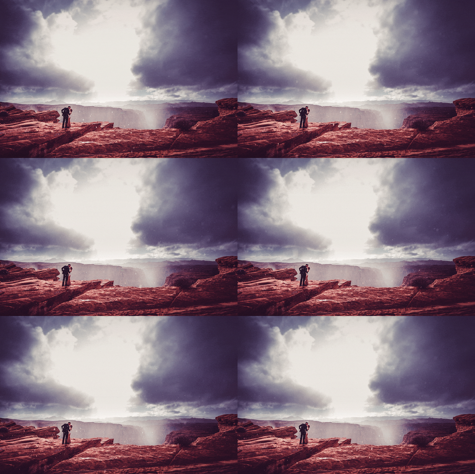
Colors
Most photographers use the same pre-packaged, commercially available presets. I’ve spent years tuning my own, exclusive, raw processing.
RAW image files are made up of all the data captured by the camera’s sensor, recorded unfiltered, and is not in any way ready for printing. Generally, these files look pretty terrible. Their benefit is offering the photographer more creative freedom in how the final images turn out. I believe the transition to digital photography lost some aesthetic magic. I have designed my processing profiles to produce a more organic image and recapture a film-like look.
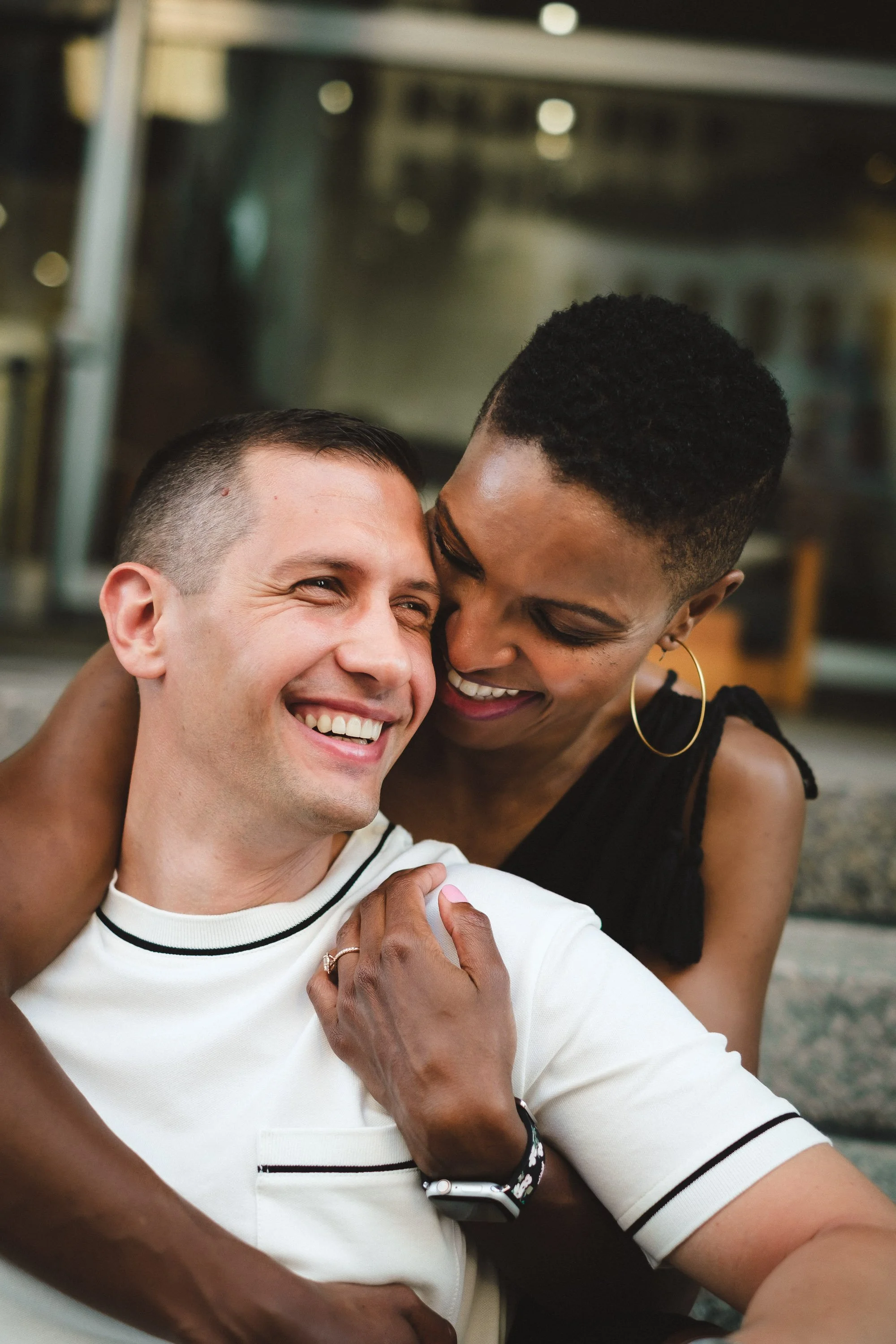
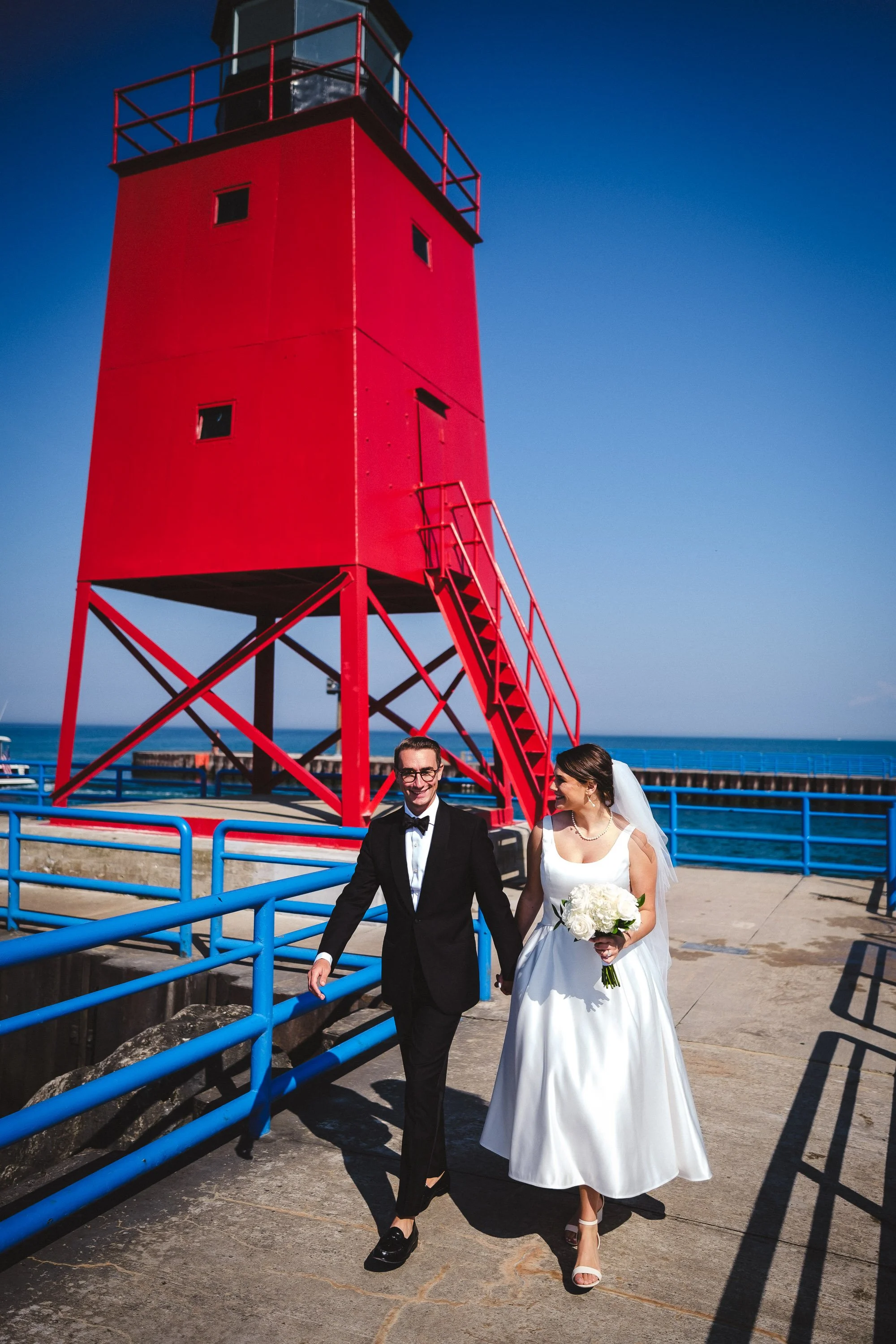
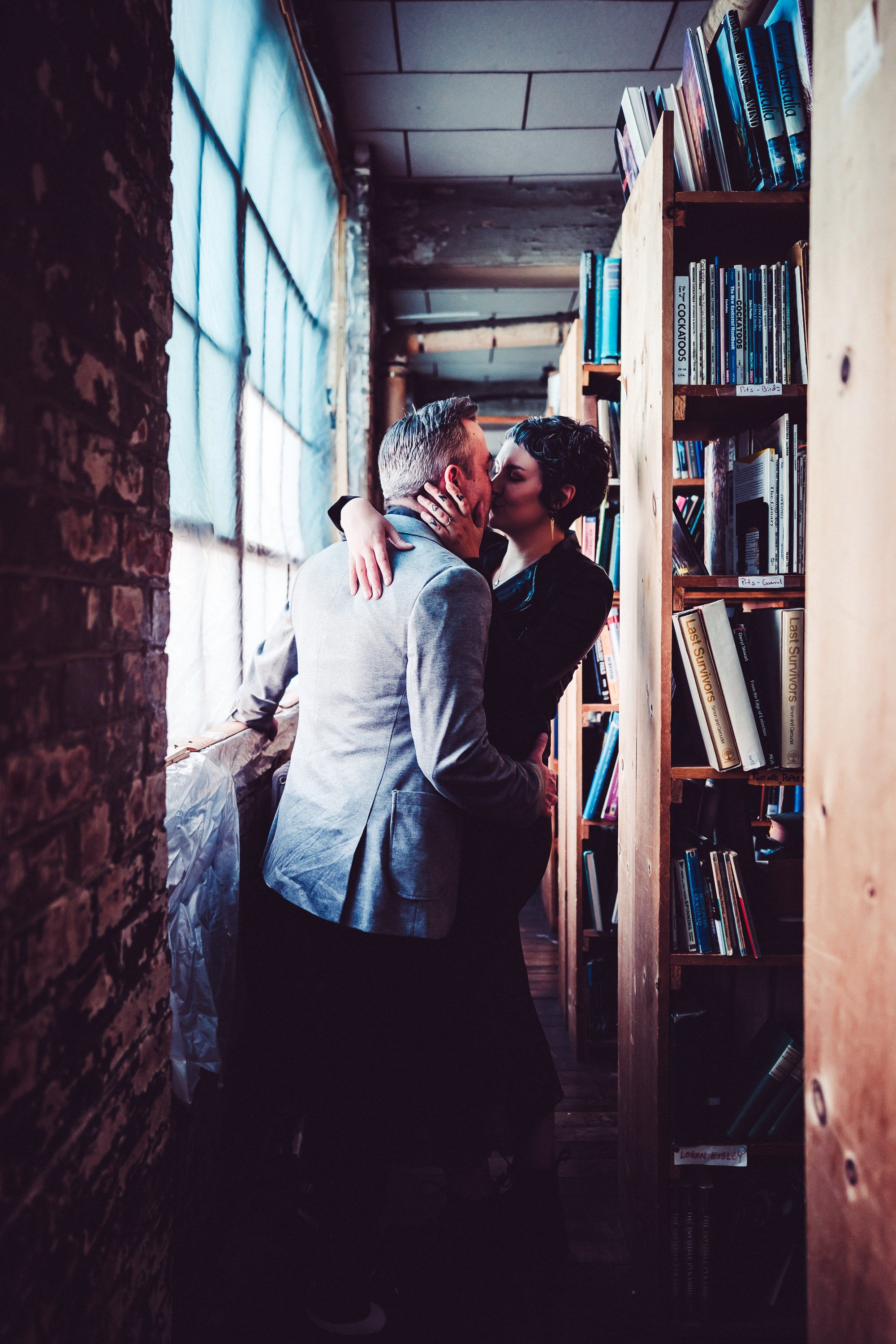
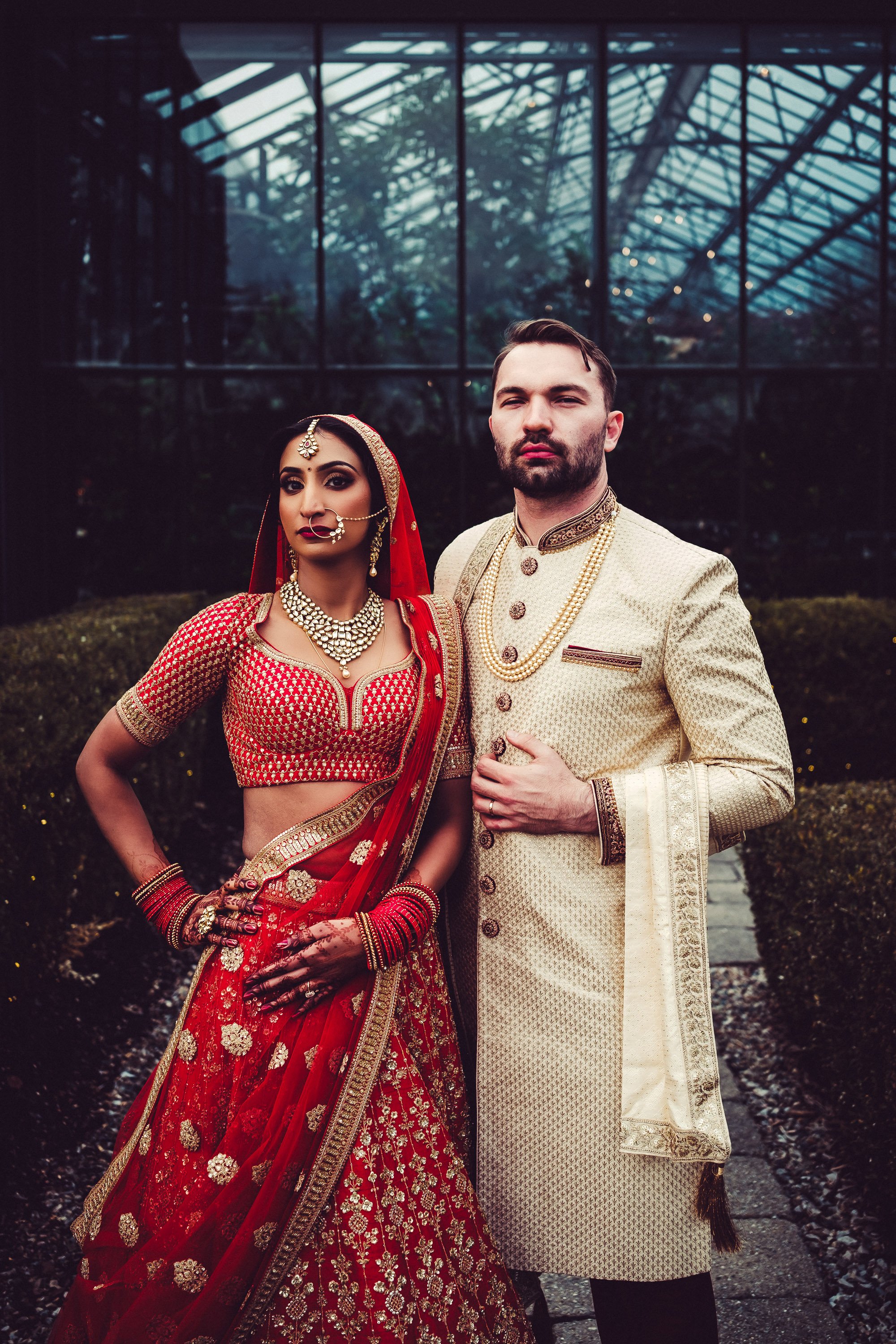
01

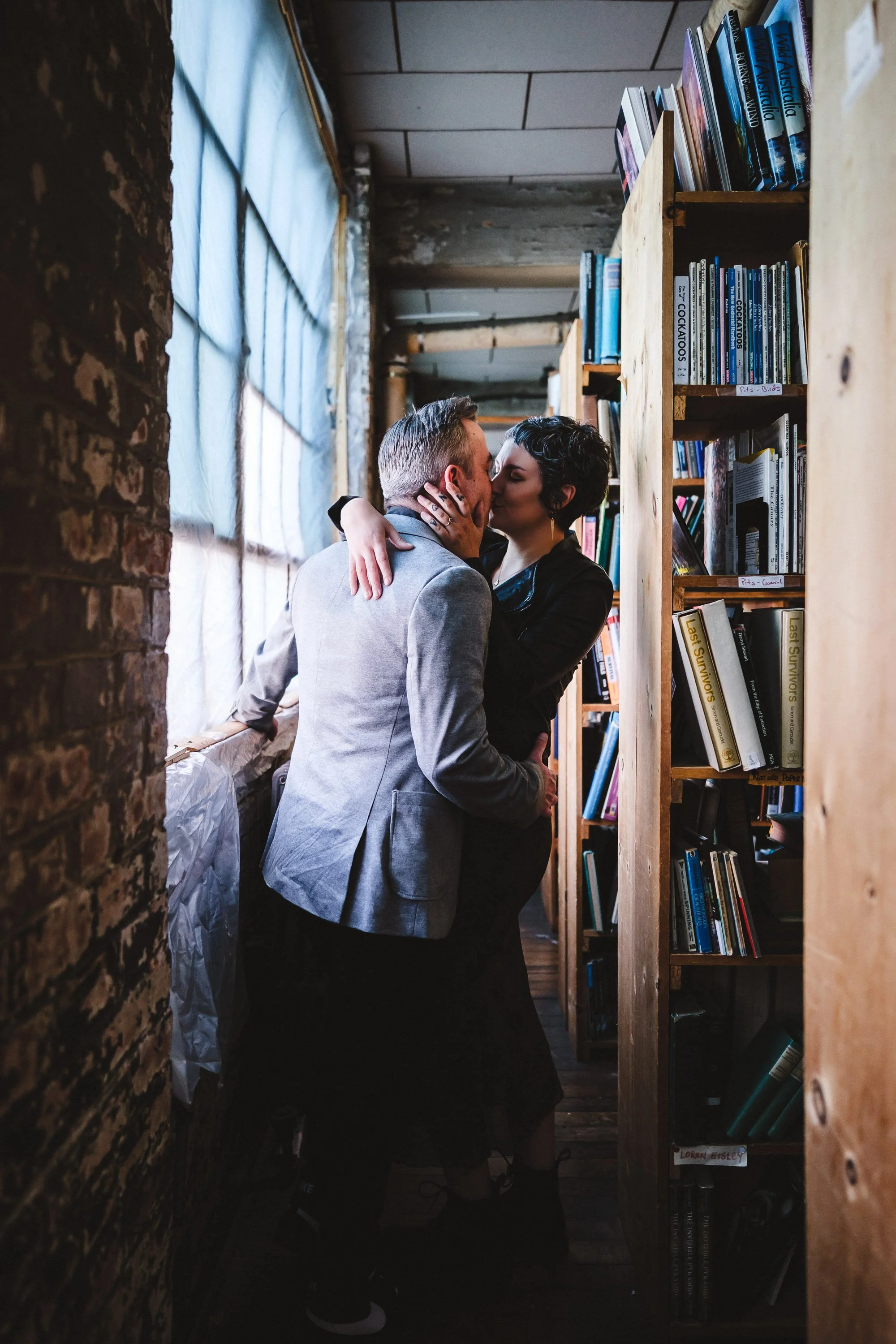
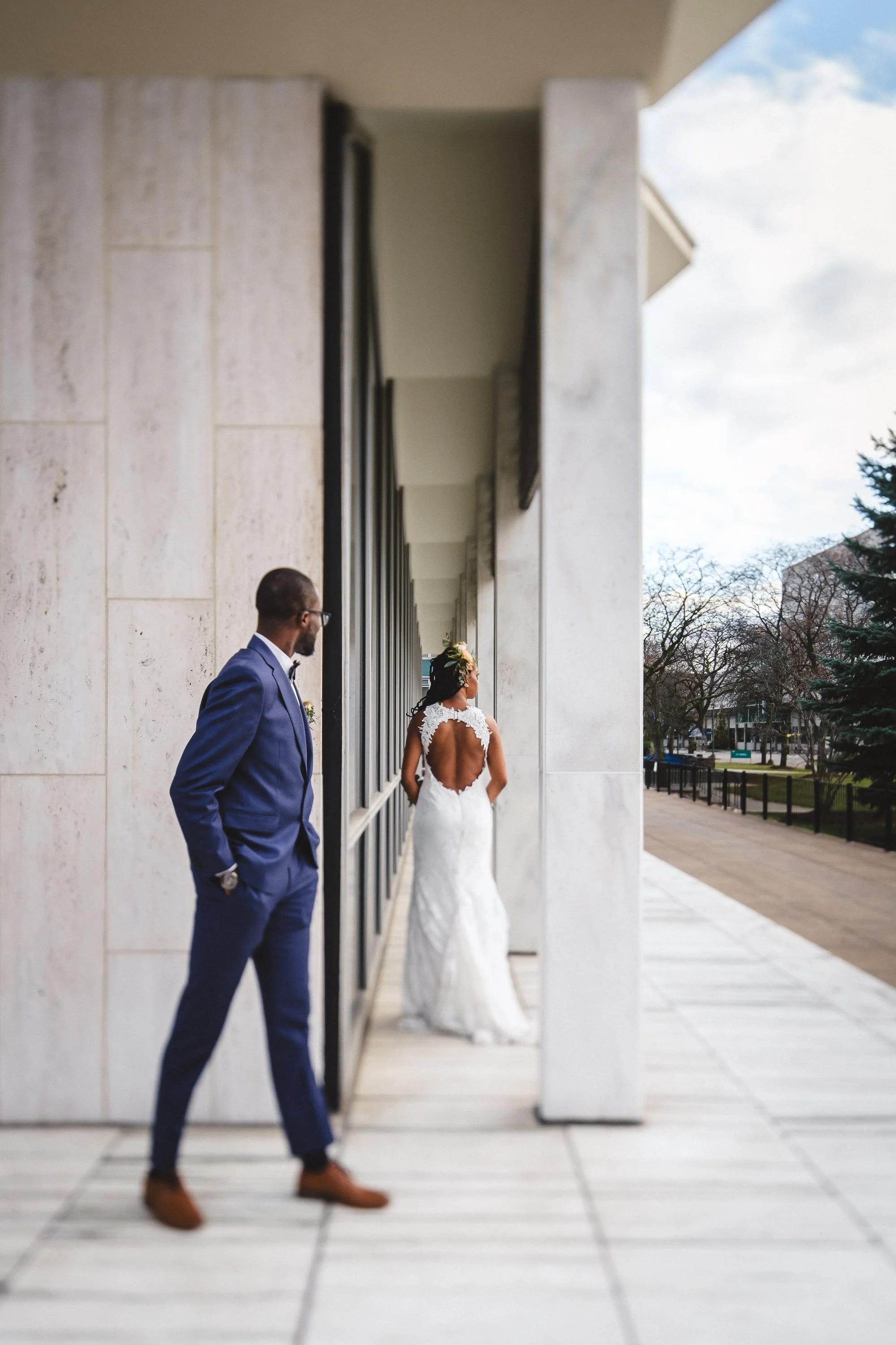
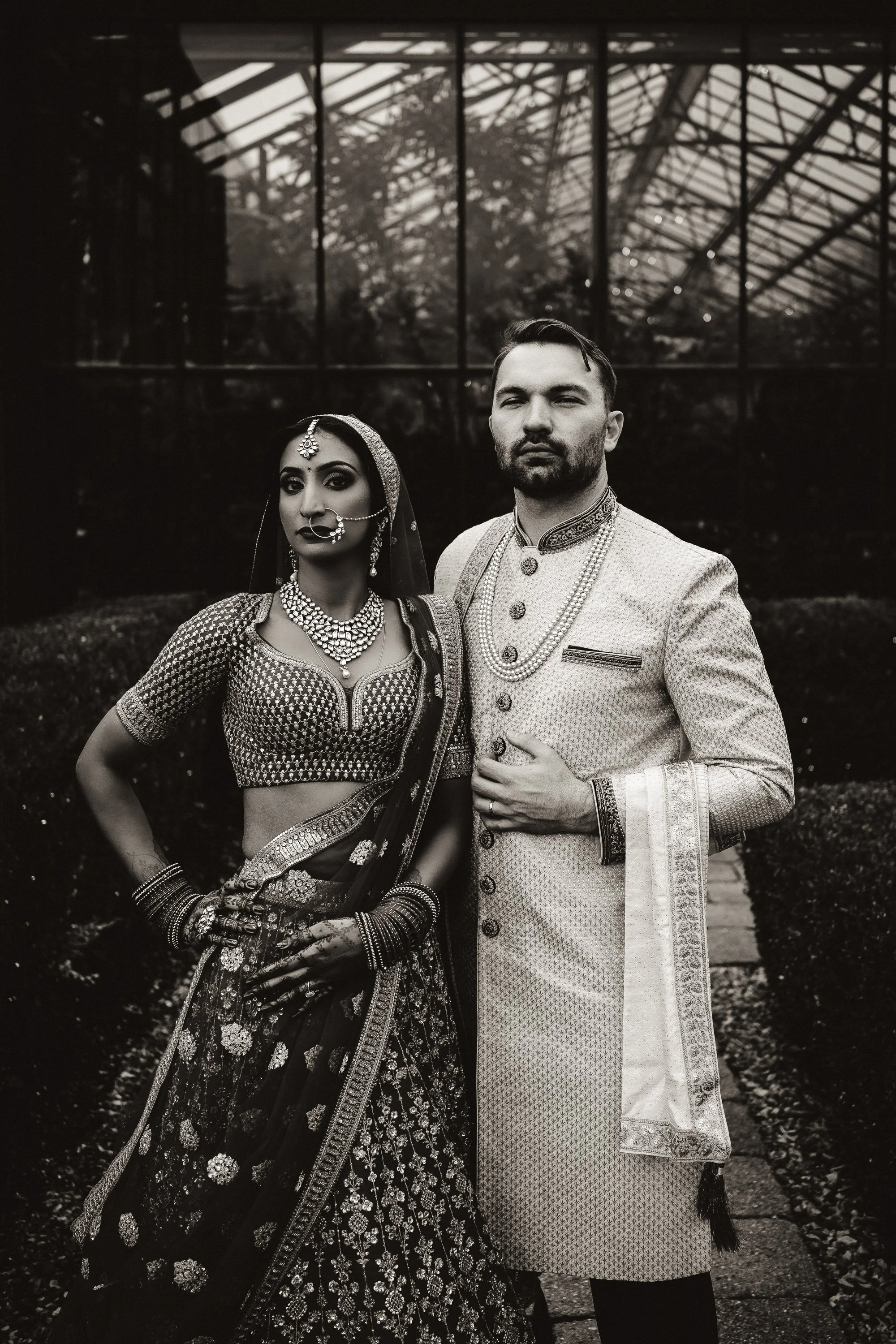
02

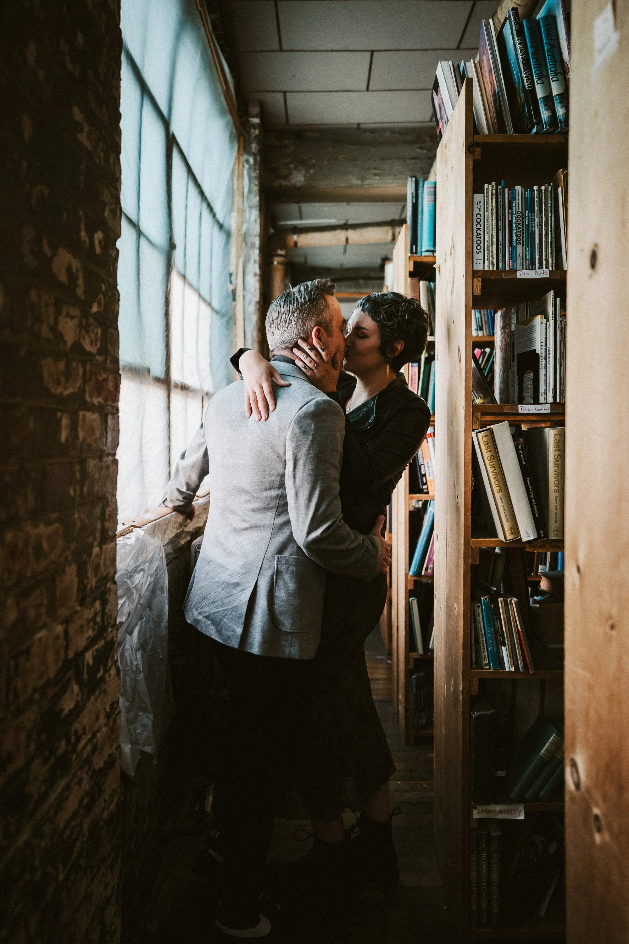
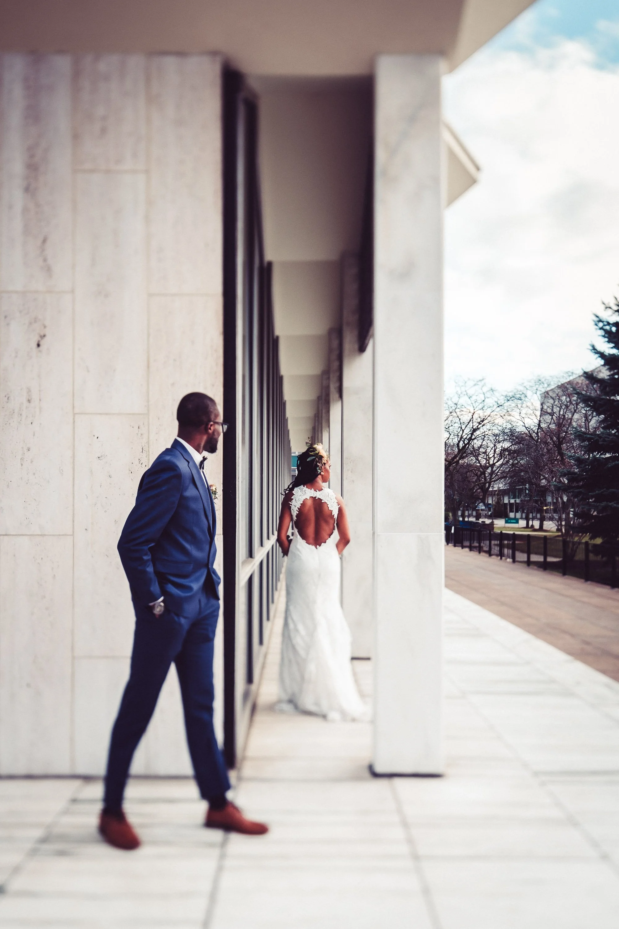
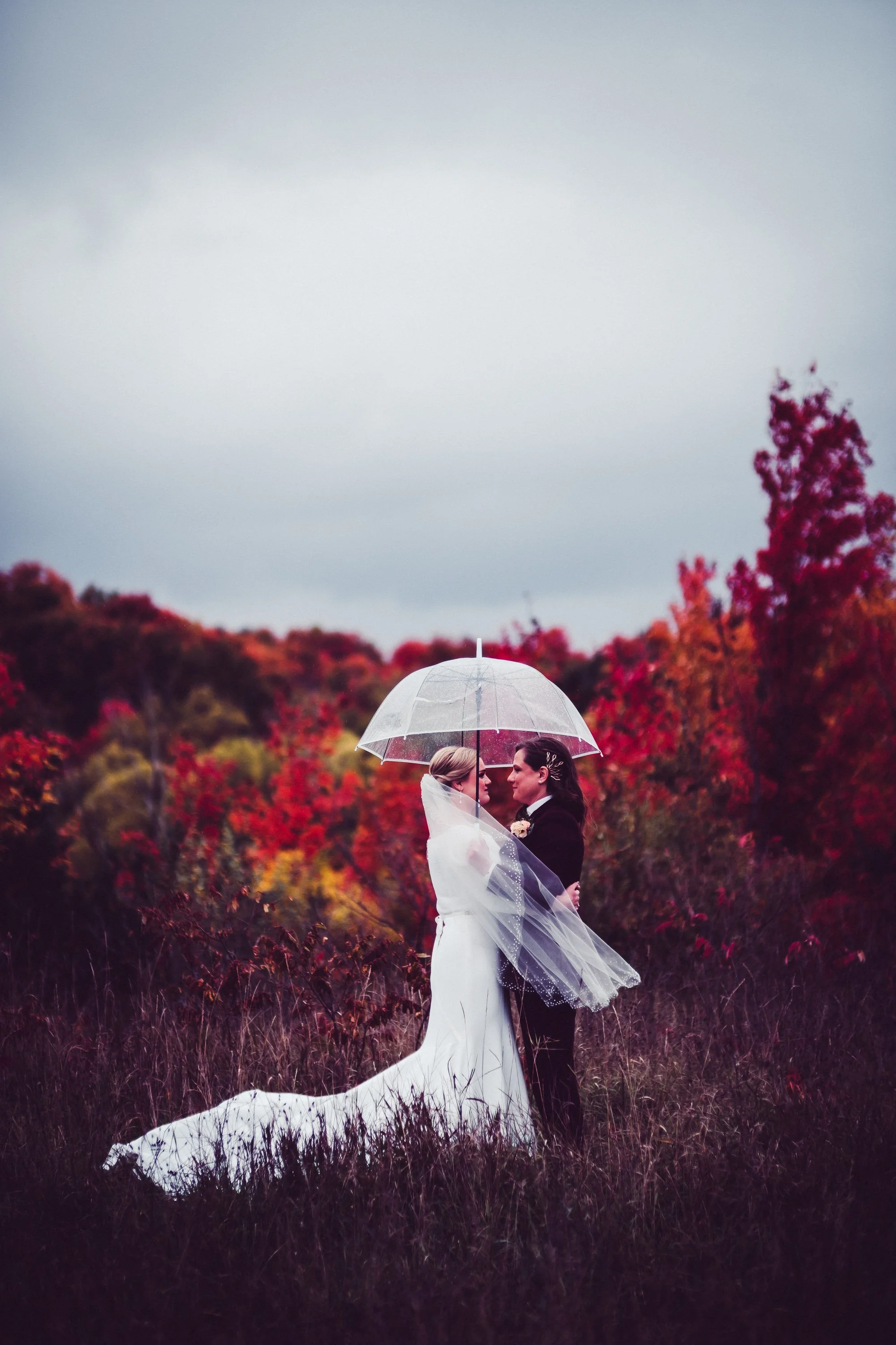
03

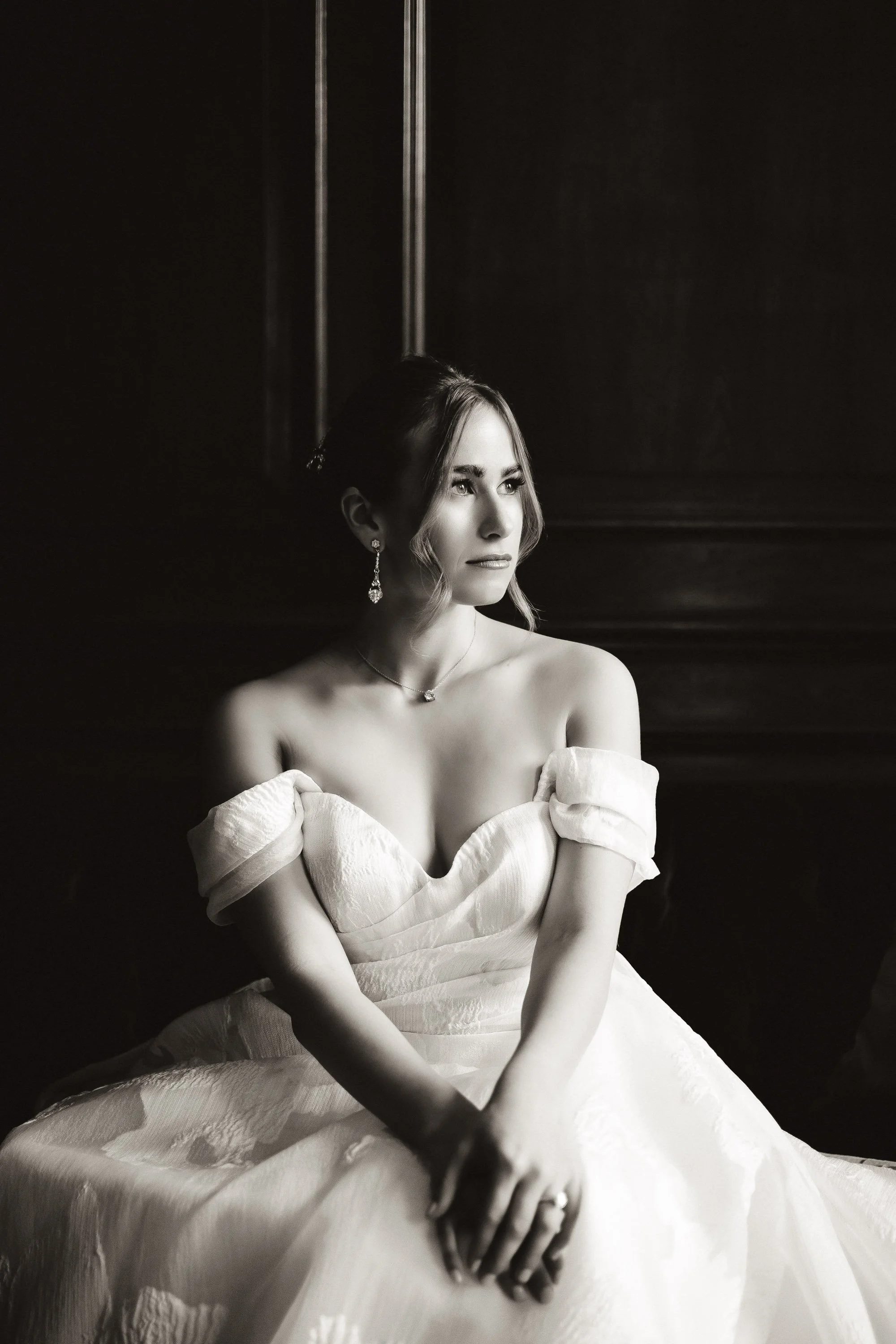
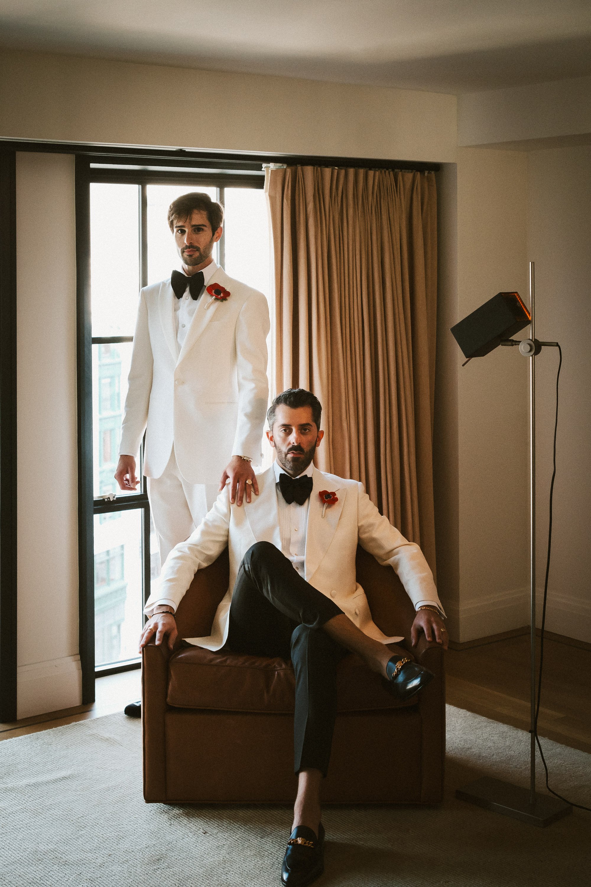
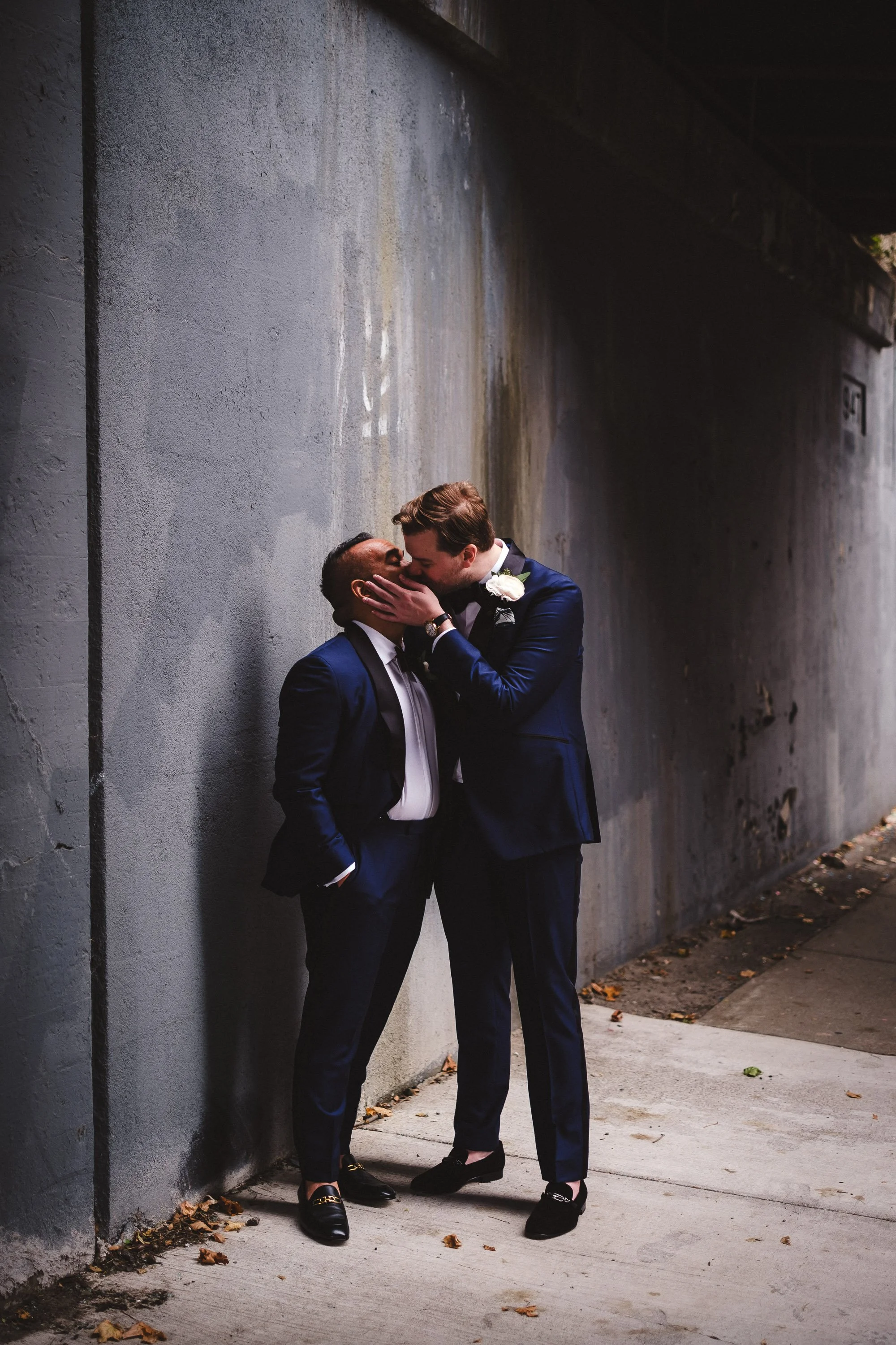
04
The colors:
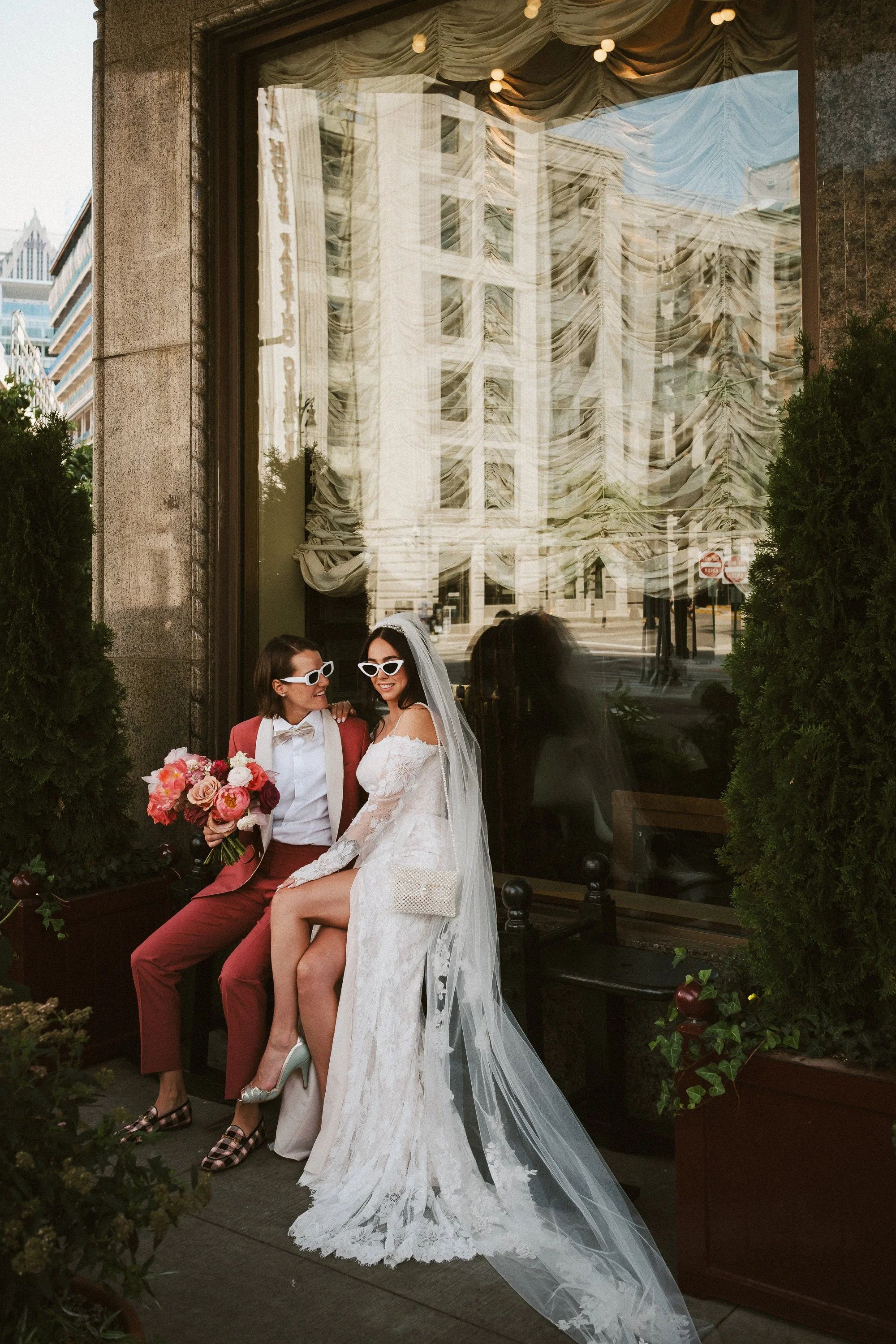
01 Corktown – balanced, classic but not boring
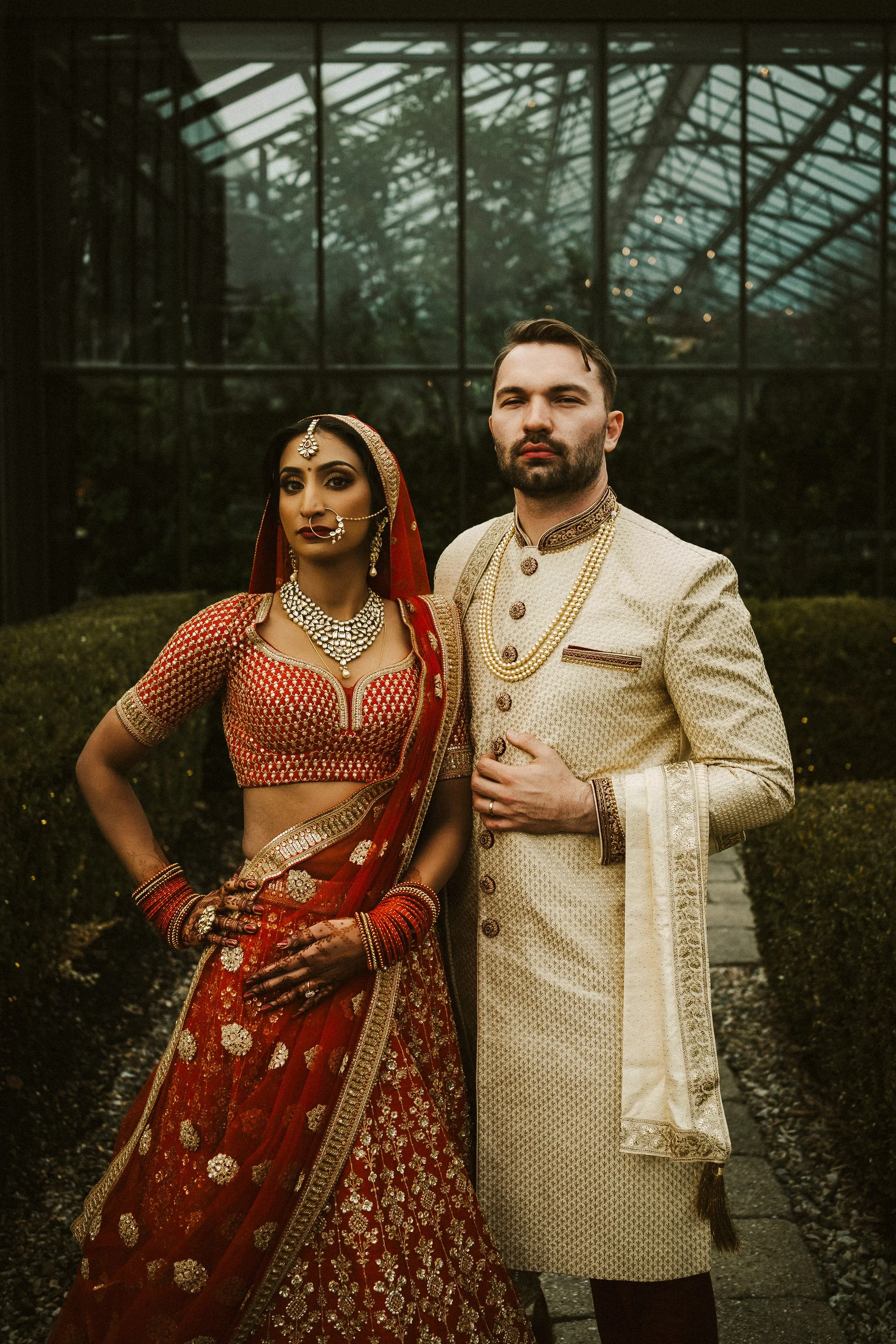
02 Woodbridge – soft, moody, warmer
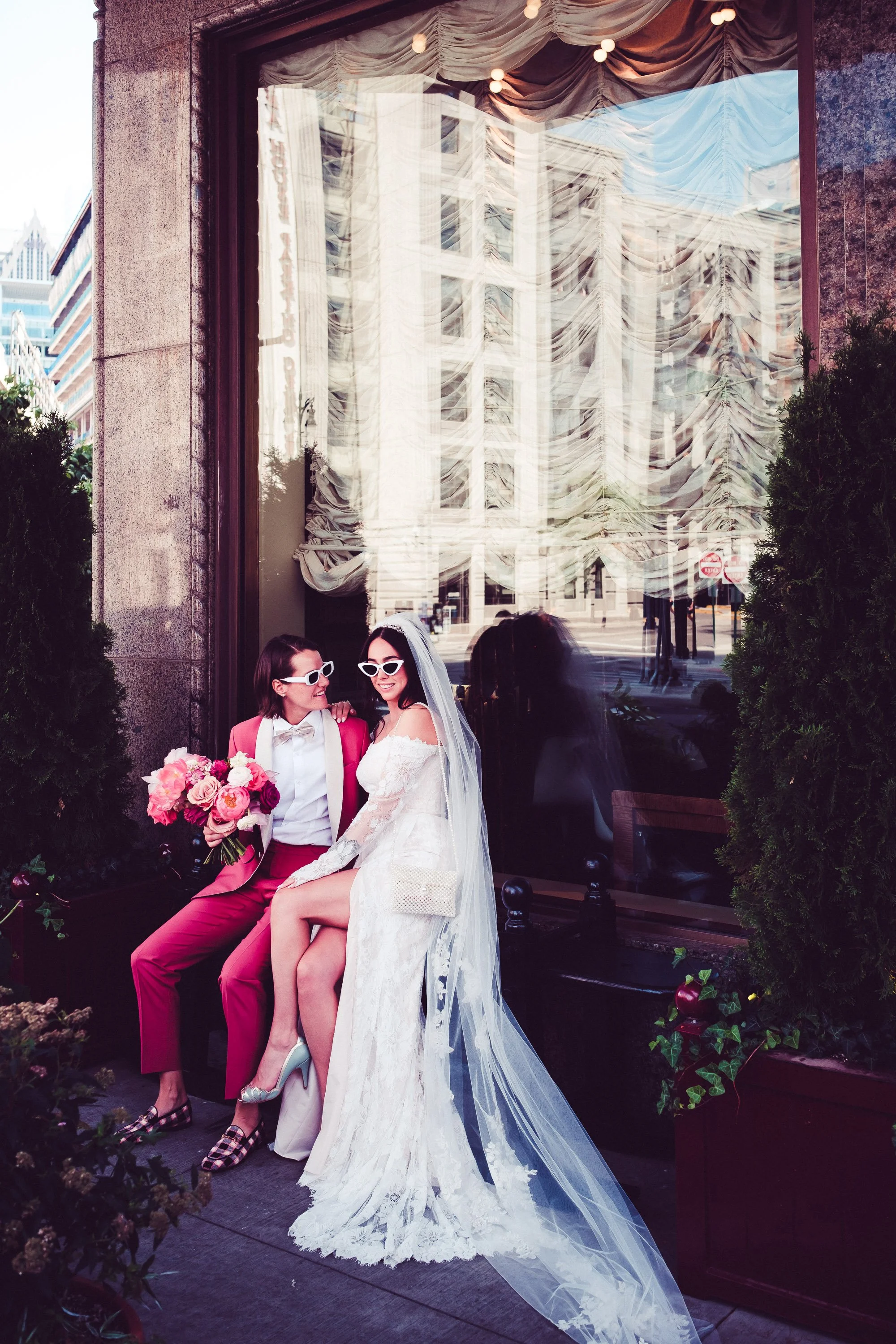
03 EasternMarket – chromatic exuberance
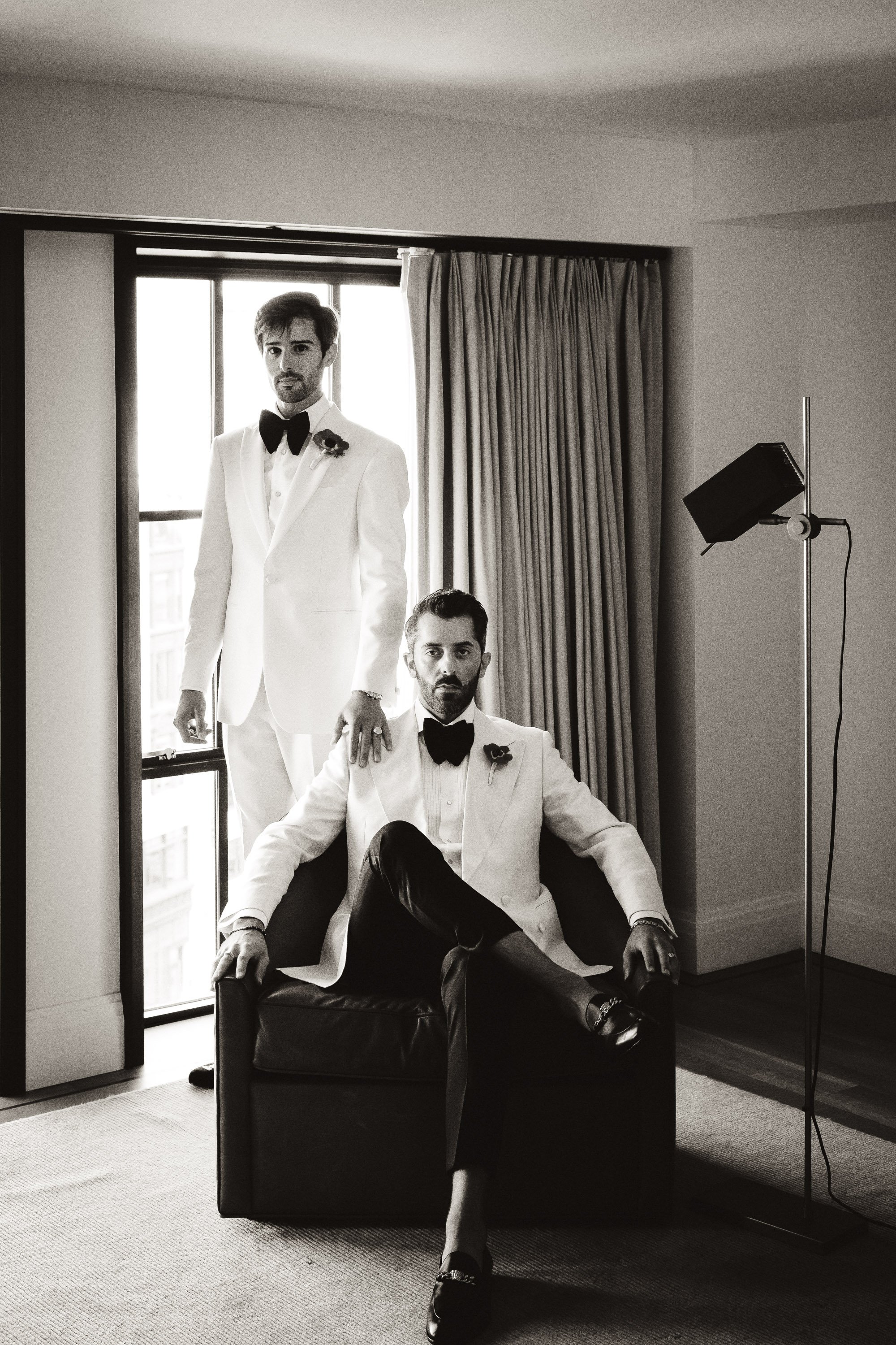
04 BrushPark – warm B&W, max contrast, crushed blacks
There’s no need to pick favorites, my clients receive all their photos in all four of these processes. I’m occasionally tweaking the colors but I will always deliver images in a standard “true-to-life color” version (01 Corktown).